When you run an online business, your call-to-action (CTA) buttons are often vitally important to your company.
In this article, we are going to talk about call-to-action best practices that WILL make people click.
This means that we are going to look at good examples of call-to-action best practices and buttons so that you can create high converting buttons that boost your businesses success. Even with the great examples and CTA characteristics that we are about to review, it’s important that you remember your call-to-action button is just one web page ingredient. Your CTA button isn’t your magic ingredient, but it’s a key part of the puzzle of the tactics to boost your conversion rate.
1. Use visually striking colors
When you are making your button, make sure that the colors are visually striking. Visually striking colors grab the attention of people on web pages, which is why they’re so important to utilize. In addition, the color that you use on your button is most effective when it is a strong contrast against the background it’s placed on.
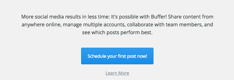
Social media scheduling tool Buffer does a great job with the call-to-action buttons on their blog. They have a light background, an eye-catching button color, and great button copy (which we will cover later):

2. Use strong verbs and language
Using strong verbs and language that inspires your users to do an action is often highly successful. This means that instead of simply writing “Click Here,” you should write, “Click Here Now.” Words that also typically do well are Register, Download, Create, and similar (But do “Register Now” not just “Register). You get the gist; figure out ways to be direct with your readers and they become a lot likelier to press and do the action that helps your business grow.
3. Put your CTA buttons in smart locations
Putting your CTA buttons in smart locations is an obvious step to take, but it’s not uncommon for websites to throw their button in a somewhat random location and hope for the best. The best location(s) for your call-to-action buttons include your header, your footer, or your sidebar. You may also experiment with CTA buttons at the end of a blog post (or even in the middle).
While call-to-action buttons are important, it’s vital to remember not to go overboard with them. If you put too many CTA’s on your website, you come off as being too salesy and this is counterproductive (and will reduce the number of clicks that you ultimately get).
4. Make your button big
You should make your call-to-action button big (but not too big!). Make your buttons a size that isn’t obnoxious, just a size that’s noticeable. It’s hard to find a good example of this since what can be considered too big is heavily dependent on your own website design. Just use good judgment, and think about your choice of size for your CTA’s and decide how you’d react if you were a visitor to your page.
5. Use easy to understand copy
Earlier, we talked about the importance of having a strong copy on your button. But, often, there is a copy before the button that begins to entice a person to complete an action. The copy that leads into your call-to-action button should concisely say what’s going to happen when a person clicks the button, in a convincing way.
Here is an example of a great call-to-action button and copy on the SumoMe blog:

If you have any other call-to-action best practices that work for you, we’d love to hear them in the comments below.
