The internet is filled with landing pages.
Landing pages are a core asset of every great online business, since every great business needs to entice sales prospects to convert into actual sales.
Since landing pages can be such an integral part of the sales funnel, we thought it would be important to share with our readers how to build high converting landing pages.
Before you start reading this post, we want to suggest that you perhaps don’t need to read further if your landing pages are already consistently converting at over 5%. If you’re converting at less than 5%, the tips we are going to share are almost guaranteed to boost your success to that magical 5% mark. But, even if you’re already converting at more than 5%, you may still be interested in this post so that you get more great ideas on how to further optimize your landing page conversion rate.
In this post, we are going to look at the key components of a great landing page. You will find WILL learn how to make landing pages that convert at higher rates.
Before we dive into the details of making high converting landing pages, it’s important for us to identify what the key components of landing pages are. These six key elements are:
- An offer.
- A headline.
- A sub-headline.
- Images.
- Button(s).
- The button copy.
Let’s actually step back even further before we talk about the six elements of a high converting landing page and simply talk about what a landing page is.
What is a landing page?
A landing page, in the most simple terms, is a web page that visitors “land” (or arrive) on. In the marketing world, landing pages are typically designed away from the main website with a single objective in mind. Since a landing page is typically separate from the normal website, this means website elements such as a navigation will be missing from the landing page design.
You may want to use landing pages for various reasons. A few reasons why you would decide to start using landing pages include:
- You want to get more people to sign up for your email list (so you offer them something like an ebook in return for their email address).
- To collect emails from your target audience to prepare for a product launch.
- Get people to sign up for an event (or even just sign up for your website).
We’ve now briefly covered what the elements are that make a good landing page and also what a landing page is. We are ready to go deeper into the components that make up high converting landing pages and examine each element in detail (with examples).
1. An offer.
You need to have a good offer on your landing page.
If your offer is bad, your page won’t convert.
A good offer is simply something that your target audience wants. The offer needs to be enticing and compelling and inspire people to engage with your conversion goal.
Some ways that you can entice your target audience to convert (we’ll use joining an email newsletter for this example) include:
- Giving a discount in return for them joining your email newsletter.
- Offering an ebook that your target audience will want, but make it so that to down it, they need to join your email newsletter.
- Creating a content upgrading, meaning that if somebody signs up for your newsletter, they can extend a blog post. So, if you have a post that is along the lines of “10 best ways to create high converting landing pages” you could have an offer at the bottom of the post that says “Join our newsletter to get three bonus tactics for creating high converting landing pages!”
There are other ways to can convince people to convert to newsletter subscribers or whatever your goal is, but you get the gist: be convincing and offer something that people actually want.
2. A headline.
A strong headline is how your present your compelling offer.
Your landing page headline is how you describe your offer and make your audience want to take an action.
Your headline is your first point of contact with the page viewer… it’s really important!
Because your headline is your first point of contact with the page viewer, it’s likely clear why this landing page element is so vital. If you have a bad headline, your visitors won’t stay on your page and will leave without doing one of your conversion goals.
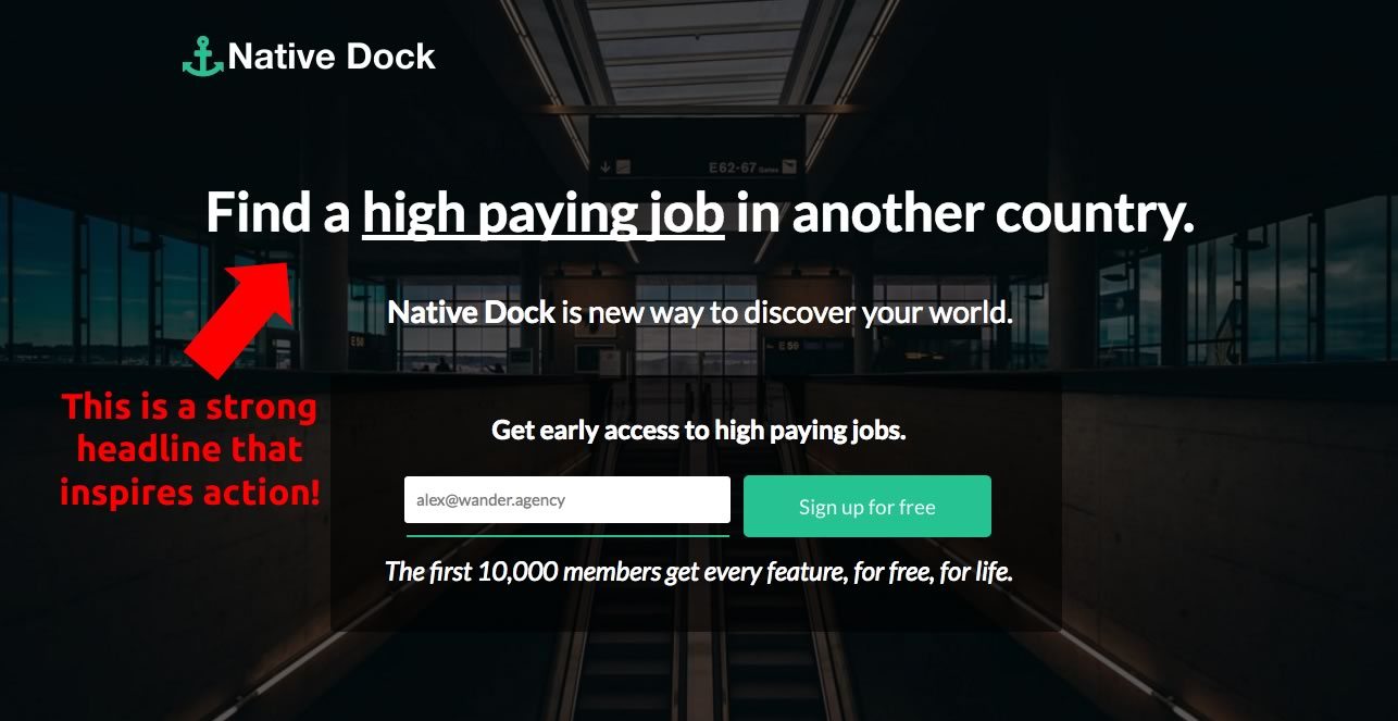
An example of a great landing page is the one on Native Dock. The page has a strong and assertive headline that makes it virtually impossible to want to sign up to learn more. At the time of writing this, the landing page (seen below) on Native Dock is converting at a staggering 47.8%:
The components of a strong headline include:
- Being focused on the benefit of your product to the sales prospect. Make your sales prospect understand what they’ll gain by engaging with your page, and write your headline so that it clearly states the primary benefit of your offer.
- Being straightforward. If you’re straightforward, your landing page will convert higher.
- Use a surprising statistic or number. Statistics and numbers can be insanely powerful. Find a number that seems almost too good to be true (but is true!) and use it to grab attention.
These three ideas will be extremely attention grabbing. When you grab the attention of a website reader and spark curiosity, you’ve made a fantastic stride towards making a person do the action that you want them to do.
3. A Sub-headline.
With your headline being very important, it can be easy to forget about your sub-headline.
Here is what a sub-headline is:
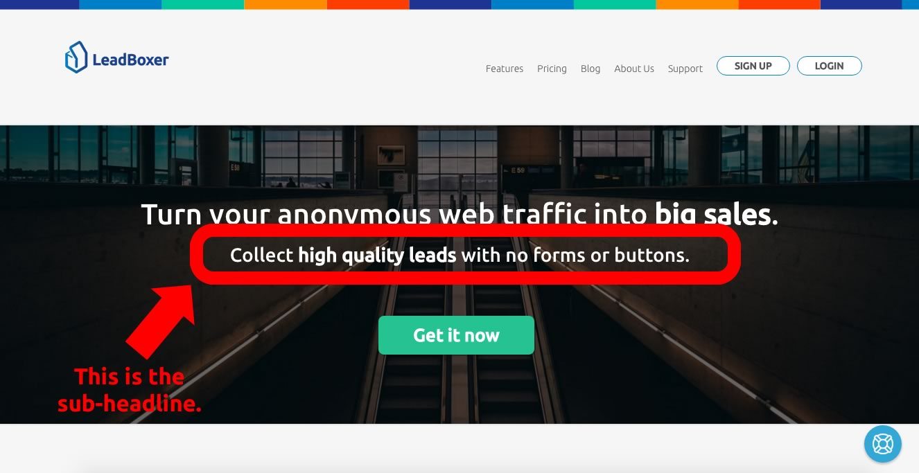
As you can probably infer, the headline is the brief initial focal point of the landing page, while the sub-headline is used to hold the attention of the visitor.
Typically, the sub-headline will describe your primary offer in more detail (but but keep it brief!).
The brief statement that makes up the sub-headline is your opportunity to really push the reader to convert into your desired page goal.
To get people to convert into your desired page goal, you need to do a brilliant job at describing your offer in your sub-headline. Let people know the value of your offer and better describe what he or she is getting.
One tactic that also works very well with a sub-heading is to tell the page reader exactly what to do. For example, you might make your sub-headline say, “Click below to get our $100 software bundle, for free.” This is an example of a great sub-headline because it tells the reader the value of what you’re offering them, while also telling them how to receive the item.
4. Images.
The images that you use on your landing page are very important.
There should be no images on your page that don’t serve a purpose, because unnecessary items on a landing page distract from the primary goal of the page.
If you distract people with images that don’t serve a specific purpose, your conversion rate will fall.
To make sure your conversion rate doesn’t fall, these are the question that you should be considering when you’re deciding what images to include on your page:
- How does this image better explain my offer?
- Does the image draw attention to or distract people from my call-to-action button?
- How effectively does it capture the attention of the person viewing the page?
- Does it make people know that other people use your product and it’s trustworthy?
Your images are meant to enhance the perception of your offering, not distract. Be mindful of your imagery and make sure it doesn’t distract from your primary goals.
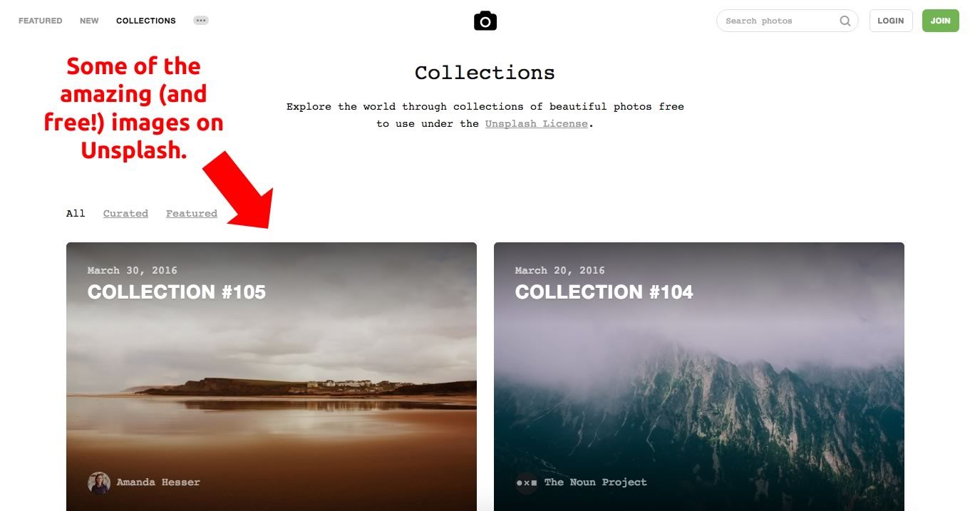
If you don’t know where to get started at finding high quality images for your landing page, we recommend trying out Unsplash. Unsplash offers ultra high quality stock images that you can use, for free.
5. Button(s).
The buttons on your page are where all of the elements that we’ve covered so far really come together when you’re building high converting landing pages.
While headline, sub-headline, and images are all important, you really want the button to be the first thing that really captures the attention of a viewer the second they are on your landing page.
You want people to notice your button(s) immediately because that is where you ultimately want engagement with your page to be.
One of the simplest tactics you can use to capture the attention of a viewer is to make your button a vibrant color. Below are examples of two buttons. Which button do you think converts better?
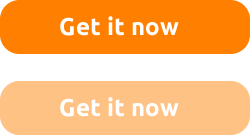
It’s easy to see why the first button is going to perform better. It’s brighter and your eye naturally gravitates to it repeatedly while on the page.
Take time to really think about your button color when building your landing page. Ask yourselves questions along the lines of:
- Is my button color vibrant and actionable?
- Does my button color blend into the background too much?
- Would I want to click this button on my page if I were a visitor?
Button color is only one portion of the landing page puzzle. What’s in the button, the text, as matters a lot.
6. The button copy.
While button color is important, we can’t stress how important the button copy also is. Typical words that are found on buttons include: “Subscribe” or “Register” or “Download.”
The typical words are good, but they’re just that: typical.
You need to stand out and be untypical to be successful online.
To stand out and be successful using your call-to-actual buttons, you should do a few of the following things:
- Use your own company branding, rather than the typical bootstrap branding.
- Use the word “get.”
- Use the word “now.”
It’s important to use your own branding because there is a reason why people were attracted to your page in the first place. They liked the first brand interaction they had with you, so keep that momentum going. Make your button colors the colors of your brand, use your fonts, etc.
In addition to using your brand fonts and colors, you should use strong words like “get” and “now.”
When you use these two strong action words, you make it so that people imagine using or getting what you’re offering at that moment. This typically inspires action to happen immediately, meaning people are much more likely to click your call-to-action button.
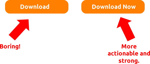
From this simple example below, you can see how important button copy is at inspiring a person to take an action:
Creating the perfect landing page.
Figuring out how to make your landing page as effective as possible is ultimately all about experimenting. Test your ideas like crazy and see what works best. When you discover the landing combination that drives the best results for you, you should then focus your effort on driving as much qualified traffic to it as possible.
If you want to collect leads from the high quality traffic that is on your landing page, without having to worry about button colors and copy, we recommend trying LeadBoxer. It’s a tool that turns allows you to collect leads with no forms or buttons. Click here to try LeadBoxer, for free.