
Making a great checkout page is important for increasing revenue.
Checkout page design is something that we’ve been spending time studying here at LeadBoxer, and we thought that we should share some of the best checkout pages we found in our research.
In this post, we are going to talk about some of the best checkout pages we have examined, why we think the pages are so effective, and discuss how you can design a checkout page that improves your conversions and turns more of your visitors into paying customers.
Here are the best checkout pages that we found:
1. Apple.
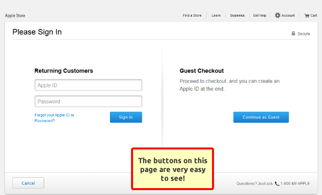
Apple has done a great job with their website. The site has strong imagery, clear pricing, and it’s an overall amazing online shopping experience. Great design is something that should be expected from Apple, so it’s only natural that they would have a great checkout page.
Apple’s checkout page is particularly good because it’s simple and functional. The page is very focused on the goals: signing in or purchasing as a guest. Having both of these options reduces cart abandonment and having vibrant blue buttons makes the goals of the page very visible.
2. Made.
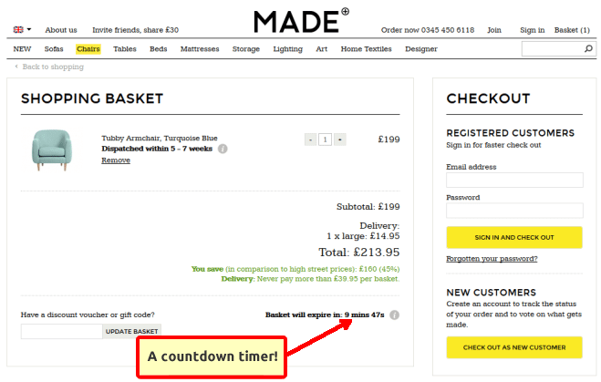
Made, an online furniture retailer, has a checkout page that is uniquely good because of a handful of thoughtful attributes.
The most important aspect on the page is a countdown timer. This makes checking out feel urgent and gives shoppers a feeling that they risk missing out on their purchase if they don’t complete it within the time displayed.
We also think that the page is good because it clearly shows shoppers how much money they are saving on his or her order. This is a simple and effective way to encourage users to finish the purchase.
3. Amazon.
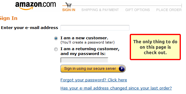
No checkout page list would be complete without Amazon. Amazon removes all distractions from the checkout flow to somewhat aggressively push buyers forward. There is no top navigation on the page, there are no continue shopping buttons, there are no buy later buttons, or anything of that nature. The only options on the page are to either continue down the shopping cart flow or close the window.
4. Bellroy.
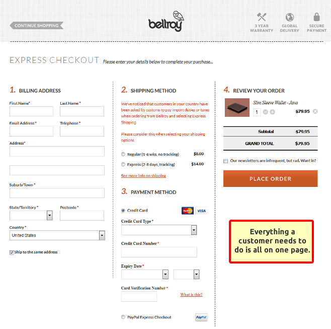
Bellroy has smartly made their shopping cart just one page long. Because checking out is only a single step, it makes the experience very smooth for shoppers.
This notion isn’t just a hunch on our part. Countless studies have shown that when checkout pages are only one page long, conversions are significantly higher. This is likely because a single page unconsciously feels less daunting and also helps eliminate the possibility of confusion.
5. Nixon.
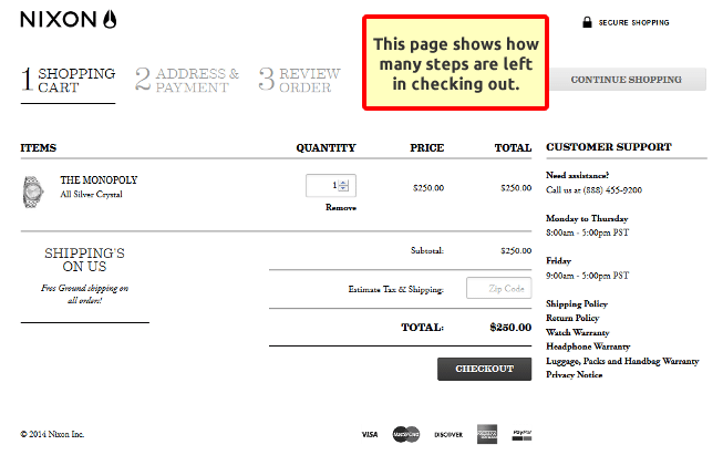
Nixon doesn’t give the option to check out as a guest, but it’s still a smartly designed page (and overall flow). The page is designed well because, no matter what part of the checkout process the customer is in, they understand exactly where they are in the flow. Shoppers are informed about the number of steps left and and understand why they need to complete each step. In addition, the page increases customer trust by clearly displaying links to pages such as the return policy, warranty details, privacy policy, and shipping policy.